OrganiClear
Creative Identity, Brand Strategy, Copywriting, Content Creation
The Client
OrganiClear is an gentle and effective alternative to the big name acne treatment products. They believe that everyone’s journey towards clear, and beautiful skin should always be a joyful, relieving experience. It should never come at the cost of pain or harmful side effects - like the other acne treatment systems.
The Opportunity
In the recent years, OrganiClear had gone through several transitions, and their brand experiences had suffered as a result. OrganiClear needed help rebranding. Having clear value propositions and content to pull from, I wase excited to partner with them to take these ideas to create consistent brand experiences and a divisible content strategy.
Services
Discovery & Research
Brand Identity
Creative Direction
Messaging Framework
Iconography
Logo Refresh
Content Creation
Motion Graphics
Web Design


The Solution
OrganiClear needed both a full rebranding, as well as a rollout plan to introduce the new brand look to internal and external audiences, including staff, partners, retailers, consumers, etc. To create a successful rebrand that could evolve with OrganiClear, I knew we needed to craft a flexible identity built around the organization’s values.
The Deliverables
Visual identity (logo, color palette)
Brand messaging (tagline, mission, vision, messaging pillars, etc.)
Brand voice and tone
Brand guidelines
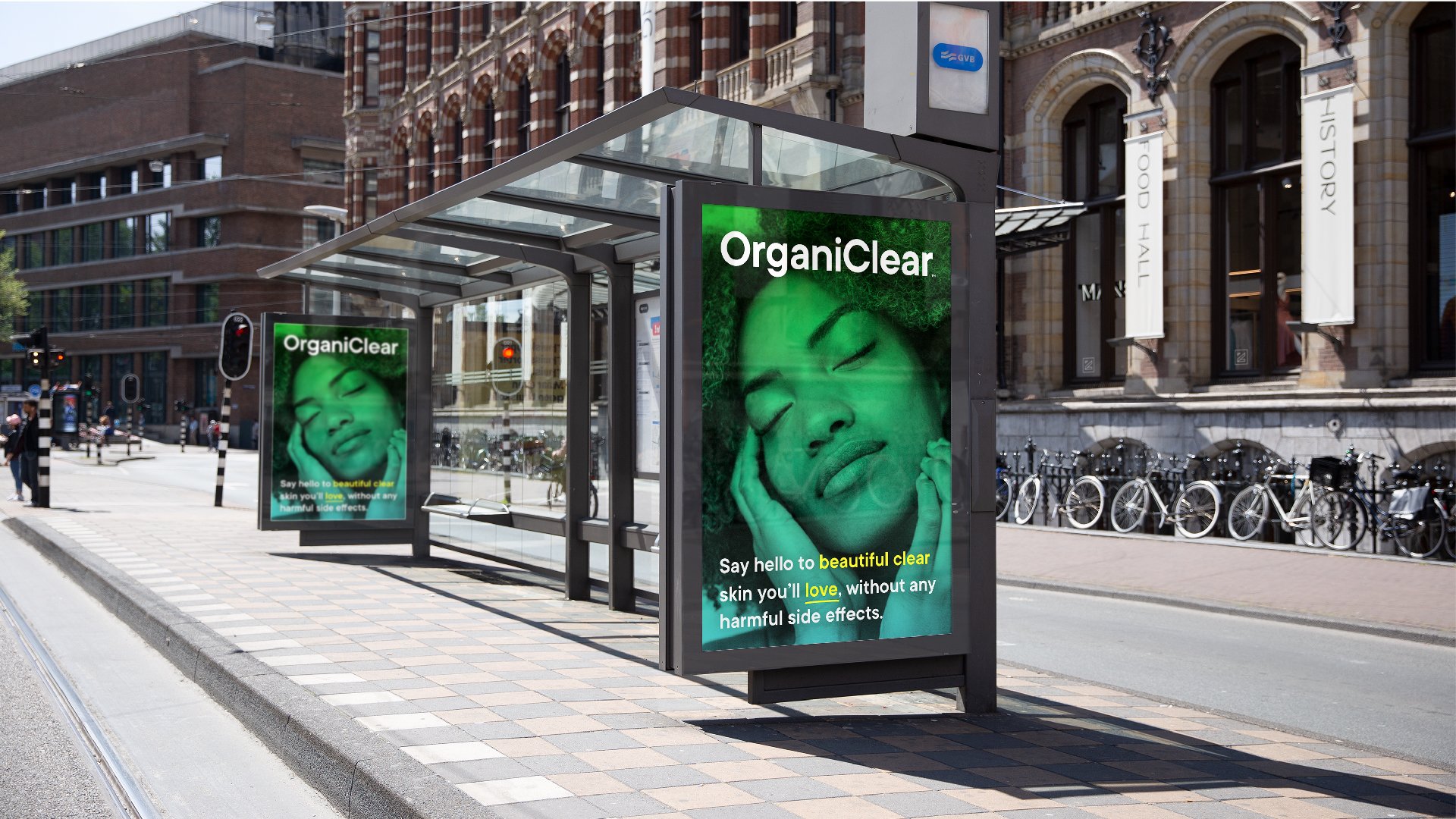
Promotional assets (digital and physical)
Rollout strategy
Content Creation
Digital Advertising
Persona development


The Execution
Focusing first on the look and feel I started by reflecting on the organization’s goal, the core of their work, what they’re trying to achieve, and how that might be communicated simply, easily, and effectively. After a deep competitive analysis and audience personas, I settled on what I felt would resonate best for our brand and market.
I took a subtler approach with the logo, thinking deeply about how we might translate their work into a visual language. To communicate that concept, I wanted the logotype feel refreshed without detaching from its original form. I updated the curves and line weight so that it maintained a bold and captivating look without sacrificing legibility. I decided to add an icon to the ID system for us on smaller applications. The concept for this was simple, a hybrid water droplet leaf icon to represent nourishment and holistic values to the brand’s namesake.
For the color palette, I used bright hydrating colors as a nod to the nourishment the product provides. The bright tones also lend an air of comfort and refreshment, making the visual language feel safe and centered.
To help the team communicate their brand consistently and cohesively through a variety of content, I also identified and articulated additional messaging elements, including voice, tone, tagline, mission, vision, and messaging pillars that align with the brand’s core values.
To make the brand easy to apply, we also crafted comprehensive brand guidelines, allowing their team to confidently create on-brand content across all digital and print assets. Crafting the promotional assets for the rebrand concurrently with the guidelines allowed us to provide real-life examples for content creators to emulate going forward.
The Results.
I’m happy to say the new branding has helped the OrganiClear re-introduce themselves to the world with renewed focus and vigor. While it’s still new, thus far it has helped encourage meaningful conversations aligned to the company’s purpose, increased clarity about their products, and most importantly equipped this outstanding group of people to effectively communicate who they are and what they do. I look forward to supporting their important mission for many years to come.