Project Legacy
Visual Identity

The situation
In Riverside County, too many are left behind. LGBTQ+ youth. HIV-positive elders. People one eviction away from invisibility. Project Legacy wasn’t just a housing facility—it was a lifeline. A promise. A necessary act of love. Our task? Give that promise a face. A voice. A heartbeat.
THE INSIGHT
People don’t dream of shelter—they dream of home.
A place to feel safe, seen, and connected. For many in Riverside County, especially LGBTQ+ youth and HIV-positive elders, that kind of belonging feels out of reach. Project Legacy exists to change that. Because true care isn’t just about offering shelter—it’s about delivering dignity, continuity, and hope.


THE IDEA
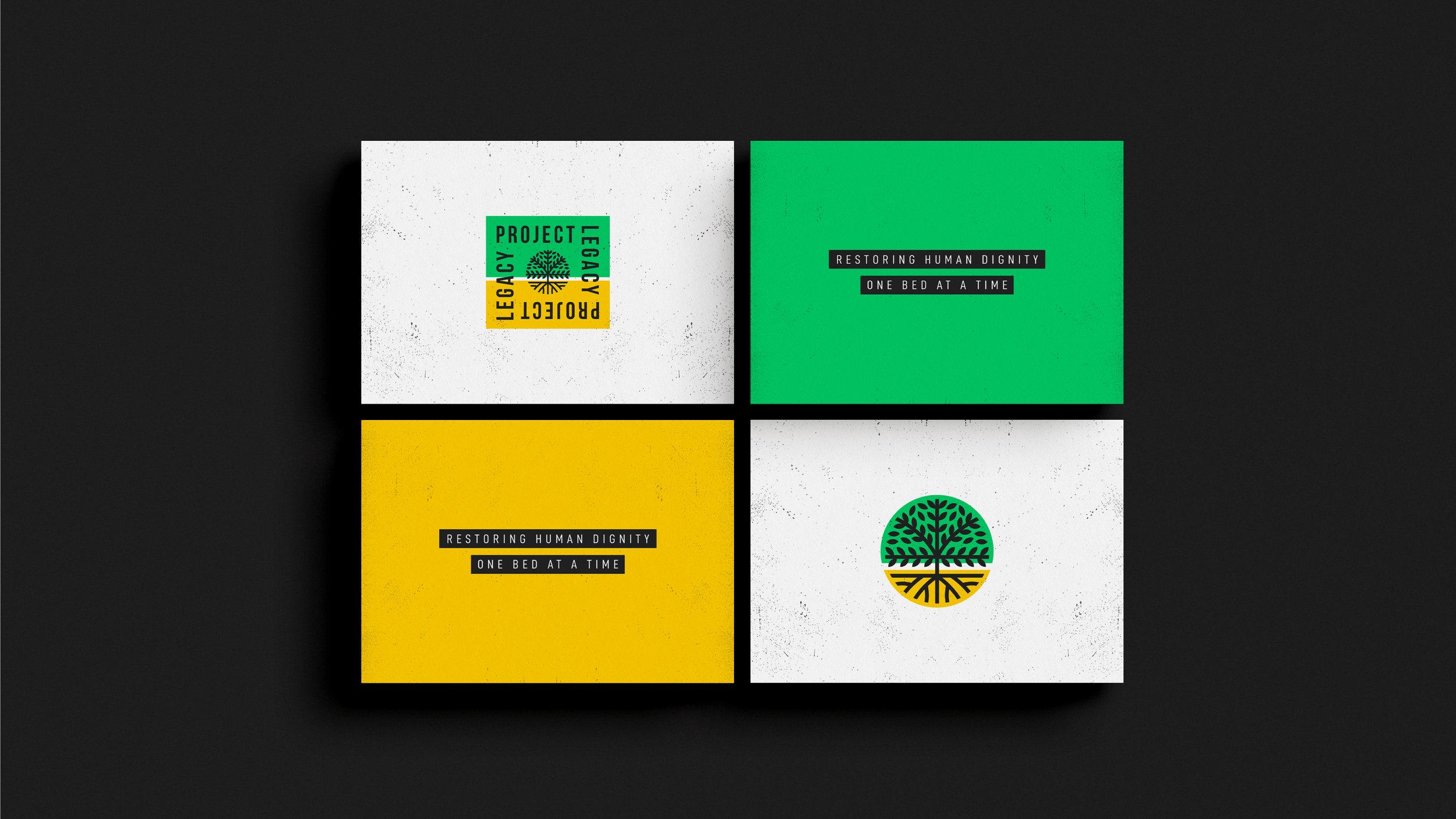
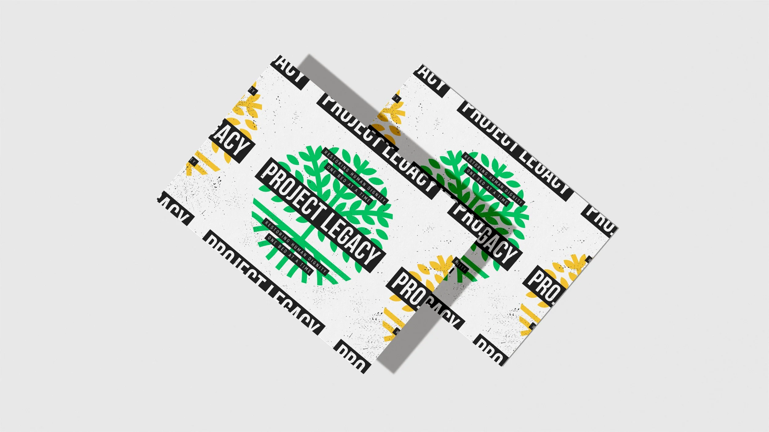
“Rooted in dignity. Designed to grow.”
This identity begins with the idea that housing is not just shelter — it's the foundation for healing, identity, and community. The geometric tree at its center represents strength through structure, and humanity through form. With bold, upright typography and a color system that bridges healthcare and LGBTQ+ pride, the brand doesn't just mark a place — it declares a purpose. It's a visual language built to restore visibility, invite belonging, and make space for growth.
THE EXECUTION
Logo: A geometric tree within a circle, with roots grounding and leaves reaching upward. A symbol of growth, healing, and belonging. It wasn’t just a mark—it was a movement.
Color Palette: Bold, saturated colors — greens and yellows — rising from despair to possibility. Inspired by LGBTQ+ and healthcare spectrums, blending pride and healing.
Typography: Bold, tall sans-serif fonts that stood proud and accessible. Unashamed and human, designed to amplify voices and reject silence.
Graphic Elements: Geometric clarity, with circles and radiating patterns to reflect unity, community, and connection. Every element served to reject stigma, honor resilience, and radiate radical hope.
Impact: The brand didn’t just appear — it transformed spaces and experiences, turning each touchpoint into an opportunity to affirm, uplift, and give visibility.


THE RESULTS
Project Legacy's new identity didn’t just look different — it felt different, and the results speak for themselves:
Emotional Impact: Families and residents were visibly moved upon encountering the new branding, with several sharing that they felt truly seen and valued for the first time.
Community Response: Within the first three months of launch, partner engagement increased by 40%, with several key organizations offering support and resources directly in response to the new brand identity.
Brand Visibility: Signage and branding efforts led to a 25% increase in foot traffic to the facility, with many visitors commenting on the welcoming, pride-filled atmosphere created by the bold design.
Resident Identification: Over 90% of residents reported feeling more confident and visible in their community after seeing the new branding in place, with many noting it created a greater sense of ownership and pride in their new home.
Media Coverage: The redesign attracted local and national media attention, contributing to a 15% rise in community donations and volunteer participation.
Because good design can’t just be seen. It must be felt.