River Rock Adventure Guides
Visual Identity / Brand Messaging
The Client
River Rock Adventure Guides is more than just an outdoor adventure brand—they’re a force for personal growth. Owner and trained therapist Taylor Gibler wanted to create a brand that spoke to something deeper: a brand that could connect the dots between the adventure outside and the transformation inside. The only problem? The brand didn’t yet reflect that powerful purpose.
The CHALLENGE
I was tasked with creating a brand identity that would capture River Rock’s mission of personal transformation through nature. But we didn’t just need to design a logo. We needed to shape an experience. A visual language that would not only stand out in the crowded wellness and outdoor space, but also make people feel that the journey to personal growth was just as important as the destination. We had to communicate that River Rock wasn’t just offering outdoor adventures—they were offering life-changing, mind-expanding, perspective-altering experiences.


The IDEA
It was clear: this had to feel like an invitation, not just a logo. We wanted the brand to look like the experience itself—authentic, grounded in nature, yet modern and professional. The visual language had to bring together the rugged beauty of the natural world and the calm, transformative clarity it provides. So, we went with the idea of strength through simplicity. A logo that conveyed the power of the environment, a color palette that captured the calming effect of nature, and visuals that inspired both trust and adventure. We wanted the brand to say: Here’s where your journey begins. And You’re ready for this.
The EXECUTION
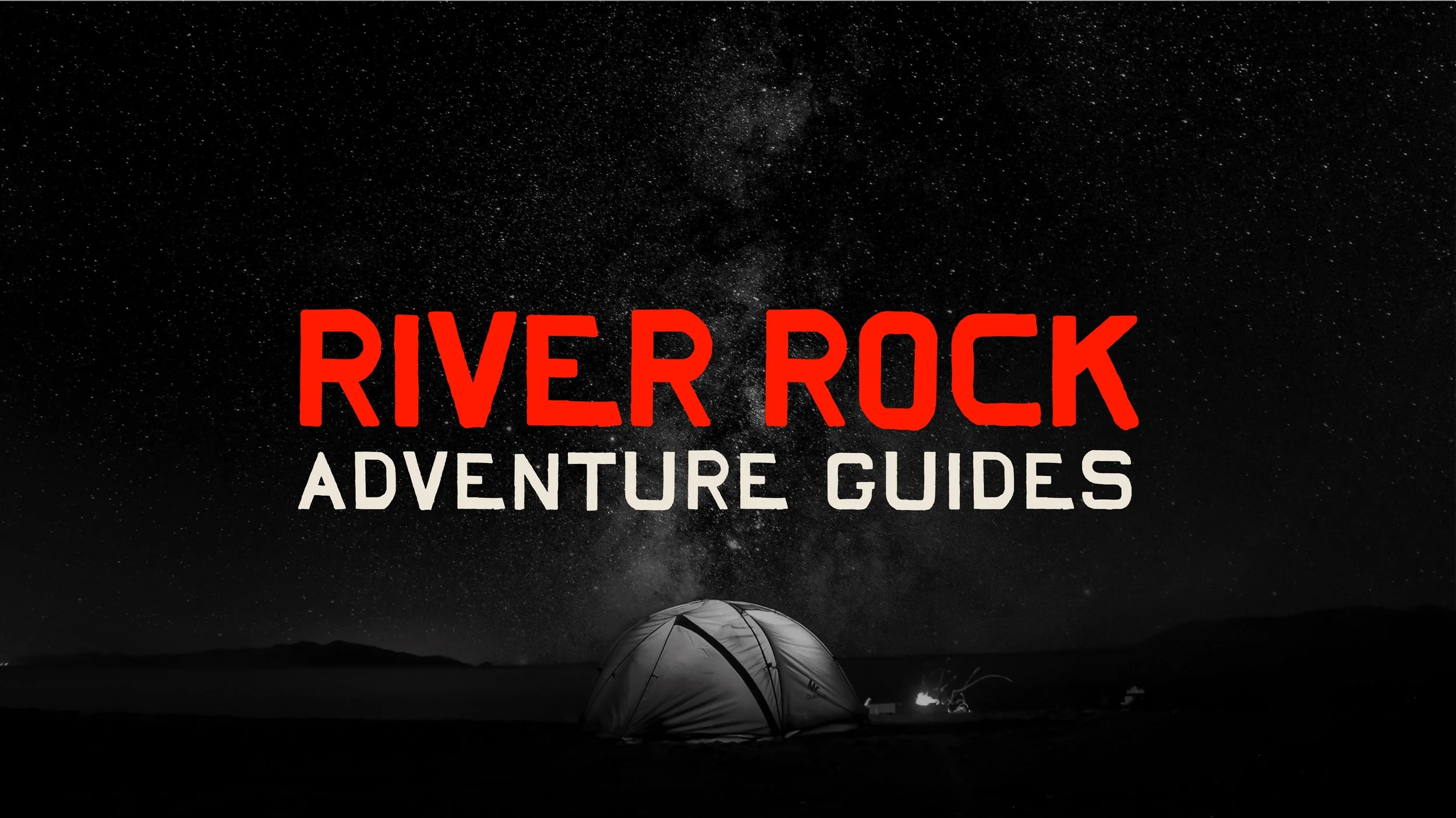
Logo & Symbol: A compass designed to feel more internal than external—directional, but also deeply human.
Color Palette: Sun-drenched tones contrasted with monochrome moments. The red-orange energizes. The black grounds. The warm off-white tones hold it all.
Typography: Headlines stand tall with hand-traced confidence. Body copy clicks along like a story unfolding—equal parts clarity and comfort.
Website: Built to feel like a gateway to something real. High contrast. Minimalist. A mix of grit and grace. A digital campfire.
Promotional Materials: Field journals. Wheatpaste posters. Stickers that look like they’ve been slapped on Nalgene bottles and climbing helmets. All telling the same story: This isn’t a weekend getaway. This is your turning point.


The RESULTS
+40% increase in bookings within three months of relaunch.
50% boost in web traffic, with a 25% uptick in conversions.
High-value partnership interest from leading wellness and outdoor brands.
And most importantly: a brand that finally looks like the mission it’s on.
River Rock Adventure Guides is no longer just a name—it’s a signal. A pulse. A call to the brave. And now, thanks to a brand built with as much purpose as their treks, people are finally seeing it for what it is: not just a guide into nature, but a guide into something far deeper.
